Is a paper-composite kitchen countertop right for your household?
Judge the finished surface, the appearance it develops in use and its actual refinishing options. The word paper does not describe a loose paper top, and through-color does not promise invisible repairs.
A paper-composite countertop can suit a household that likes its finished feel, accepts a developing surface appearance and chooses a maintenance routine it can live with. It is a weaker match for someone expecting a permanently untouched showroom surface or assuming every finish can be sanded back in the same way. Choose the actual finished countertop, including its exposed edge and care instructions. Neither the word paper nor a promise of refinishing is enough to explain how the kitchen will look and work over time.
The paper is part of a manufactured composite
PaperStone describes paper pressed with resin into a composite. Its Solid and Designer panels have through-body color, while CoverPly has PaperStone faces over birch plywood. That distinction matters before evaluating a sample. A product-family name does not establish the section of every panel carrying it. For a kitchen top, identify the actual offered construction and then inspect the finished edge and sink opening. The buyer should not imagine either exposed loose paper or an interchangeable sheet simply because paper appears in the material description.
Richlite describes its countertops as developing deeper tone and more luster in heavily used areas, with subtle lengthwise striations. The purchasing implication is to judge whether a changing surface fits the room. A single new swatch can be attractive without answering that question. Compare the proposed finish with an example that shows the kind of use-related appearance being discussed, rather than treating a fresh color chip as a promise of an unchanging countertop. The original sample remains useful for identification, but the household’s expectations should include how it intends to use the surface.
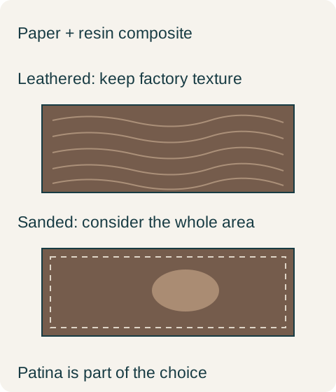
Richlite’s care guide says not to sand its leathered factory surface; for sanded surfaces, local refinishing can look lighter, and whole-surface refinishing addresses that contrast. Those are different restoration paths within one material family. A buyer who likes the word renewable should therefore identify the exact finish attached to that promise. The relevant choice is whether preserving the selected texture or accepting a future broader refinishing operation better matches the household. Through-color by itself does not decide between those preferences.
Diagram Conceptual finish comparison based on Richlite care guidance. The upper textured surface is not a sanding instruction; the lower pale patch shows possible local-refinishing contrast, not a guaranteed repair result or fixed aging period.
A household chooses the surface it can maintain
In a hypothetical remodel, the owners like a paper-composite sample and want the possibility of having the working surface refinished later. They initially prefer a leathered sample, but preserving that specific factory texture is less important to them than the proposed refinishing route. After comparing completed samples, they select the offered sanded-and-finished top. They accept that a local repair might be visible and that a broader area may need professional treatment. The order keeps the chosen finish and complete fabrication scope, instead of accepting a leathered substitution merely because the base color is similar.
This choice does not promise that all future damage can be erased. It records what the owners value and what they are willing to do if the appearance needs attention. They accept a used countertop as a working surface, while retaining a route for assessing and treating damage. A household that values the original textured feel more highly could choose the leathered option and keep its maintenance within that finish’s instructions. Neither household needs to call the other surface a lower-quality material.
Daily habits still matter
PaperStone’s information guide recommends a cutting board, a trivet and prompt spill removal, together with an initial finishing treatment for the new top. Those are practical habits to evaluate before purchase. In the hypothetical kitchen, the owners already use a separate cutting board and have a designated landing place for hot cookware. The new surface therefore fits the way they cook. Someone who expects to cut directly on the counter or place every hot pan anywhere would be accepting a different routine, and should include that change in the material decision.
Set aside a convenient place for the board and trivet in the actual kitchen. A care requirement is easier to follow when the needed object is close to the task; leaving it buried behind rarely used equipment works against the intended routine. In the example, the owners keep the board beside the preparation area and the heat-protection item where pans leave the cooking zone.
Inspect the finished top at the places you will touch
A small face sample cannot show every part of the purchase. Handle a finished edge, look at the selected sink-opening treatment and inspect a proposed seam in the actual surface finish. The purpose is not to demand that all edges disappear. It is to decide whether the completed details suit the intended kitchen. In the hypothetical project, the owners accept the edge and seam appearance together with the sanded finish, rather than discovering after installation that they preferred the sample’s untouched factory edge to the fabricated one.
Compare complete offers at that same delivered state. A raw sheet price and a fitted top with finishing, cutouts and agreed support details are different scopes. If a competing material requires a different edge, mounting approach or care routine, keep those differences visible in the comparison. Do not assign a universal saving or premium to paper composite as a category. The owners in the example select the finished package they reviewed because it supplies the appearance and maintenance path they want, not because a material slogan proves it must be cheaper or better.
Pure White
Cream White
Light Warm Gray
Gray
Navy
Black
Oak Tone
Dark Walnut Tone
Design study These finish studies are design references, not a list of currently orderable colors. Screens and lighting change the appearance; compare a physical sample before choosing.See all finish options →
Compare the complete section and fabrication scope when substituting compact laminate for a faced wood-based board. A matching decor does not make the parts interchangeable.
A patterned surface and a patterned slab body are different features. Compare an actual cut edge and sink opening before choosing the fabrication detail.
Compare the actual countertop products, heat-source routine and fabrication proposal. A fired porcelain slab and resin-bound quartz are different materials, but neither label replaces a complete kitchen specification.
The sample shows the door frame, a separate center panel, the face frame and the cabinet box. Each component has its own place in this Shaker construction.
Shaker construction: door frame, center panel, face frame and cabinet box. The cutaway helps locate these parts; confirm each material in the specifications for the selected cabinet.
01 / Door frame
The Shaker door has rails and stiles around a separate center panel. The frame and center panel are different components; confirm their materials in the specifications for the selected cabinet.
02 / Face frame
The face frame surrounds the opening at the front of the cabinet box and sits behind the doors. The face frame, door frame and cabinet box are separate parts.
03 / Cabinet box
The sample exposes the cabinet sides, interior surfaces and layered edges. The image does not establish the wood species or material specification of a selected cabinet.