Choose a white cabinet finish beside the floor, countertop and trim that will remain in the room. The goal is not to find the whitest sample in isolation. It is to decide whether the cabinet white should blend with those surfaces or create a deliberate contrast, then verify that relationship with the actual finished sample before ordering.
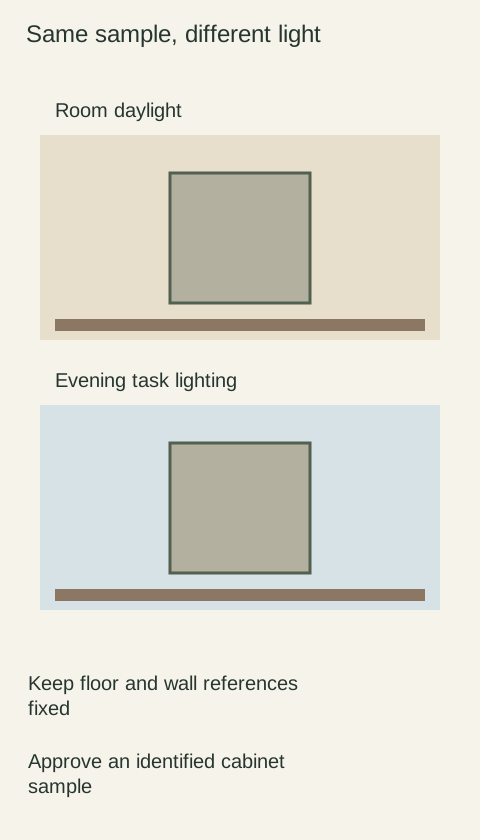
Diagram Conceptual comparison keeps the surrounding references in place. Screen colors are illustrative and do not specify any white cabinet finish.
Establish which surfaces are staying
Start by separating fixed decisions from open choices. If the countertop and floor are staying, use them as the comparison anchors. A wall color that you are willing to repaint should not quietly become the deciding constraint. Include existing trim or an appliance face when it directly meets the new cabinetry and its white will remain visible.
Write down the desired relationship in plain language: soft against the countertop, distinct from the trim, or calm beside a busy floor. These are design preferences, not rules about which white is correct. When several surfaces disagree, give priority to the prominent permanent junction instead of expecting one finish to match everything throughout the home.
Compare whites together, then remove the distractions
Benjamin Moore explains that whites can carry warm or cool undertones and recommends comparing samples against existing furnishings. The useful lesson for cabinet selection is relational: a finish that appears neutral alone may show a tint beside another white. A wall-paint color name, however, does not identify an equivalent factory cabinet finish.
Place your cabinet candidates together briefly to see their differences, then review each against the fixed surfaces without the competing candidates. A very bright white can make a nearby softer white seem creamier by comparison. Decide whether you dislike the candidate in the actual room or only dislike how it looks beside a sample you will not use.
Put the sample where the cabinet face will be
Support the cabinet sample upright, with the countertop sample horizontal if it is not yet installed. Keep the existing floor visible below. Laying every material flat on a desk can create a pleasing collection that does not reproduce the relationships of the finished room. Use clean, identified samples of the actual finish and sheen being considered.
View the grouping from the normal approach and from a close comparison position. Check the room during its ordinary daylight and electric-light use, keeping the other materials in place. Record which surface makes a candidate feel too yellow, pink, gray or stark to you. A specific observation is easier to act on than a note that simply says “wrong white.”
A worked decision with a creamy countertop
Imagine retaining a cream-colored countertop and a brown floor while replacing the cabinets. A crisp cabinet white looks appealing alone, but beside the countertop it makes the top look more yellow than you want. A softer candidate creates a quieter junction, yet looks noticeably warmer than the existing bright trim.
The choice is now clear enough to discuss: accept contrast with the trim, change the trim if it is genuinely within your project scope, or keep searching for a cabinet finish that balances both. Do not approve the crisp sample merely because it photographed better. Also avoid assuming that choosing a warmer cabinet requires every other surface in the room to become warm.
Turn the visual decision into a usable order record
Once the grouping works, identify the cabinet finish by the supplier’s exact name and code, plus the relevant door style and sheen. Keep the approved physical sample if available under the supplier’s sample arrangement. Save photographs as a record of placement and comparison, not as a reliable color target for another screen or a replacement paint formula.
At delivery, compare the labeled product with the approved sample under comparable conditions before the room is fully assembled. A difference may involve finish identity, sheen, lighting or the surrounding materials; describe what you see before assigning a cause. If a major fixed surface changes during the project, reopen the grouping comparison while the cabinet choice can still be changed through the agreed order process.
Pure White
Cream White
Light Warm Gray
Gray
Navy
Black
Oak Tone
Dark Walnut Tone
Design study These finish studies are design references, not a list of currently orderable colors. Screens and lighting change the appearance; compare a physical sample before choosing.See all finish options →
A color name does not identify a finish system. Compare the decorative surface, the core, the edge and the repair method before choosing a cabinet front.
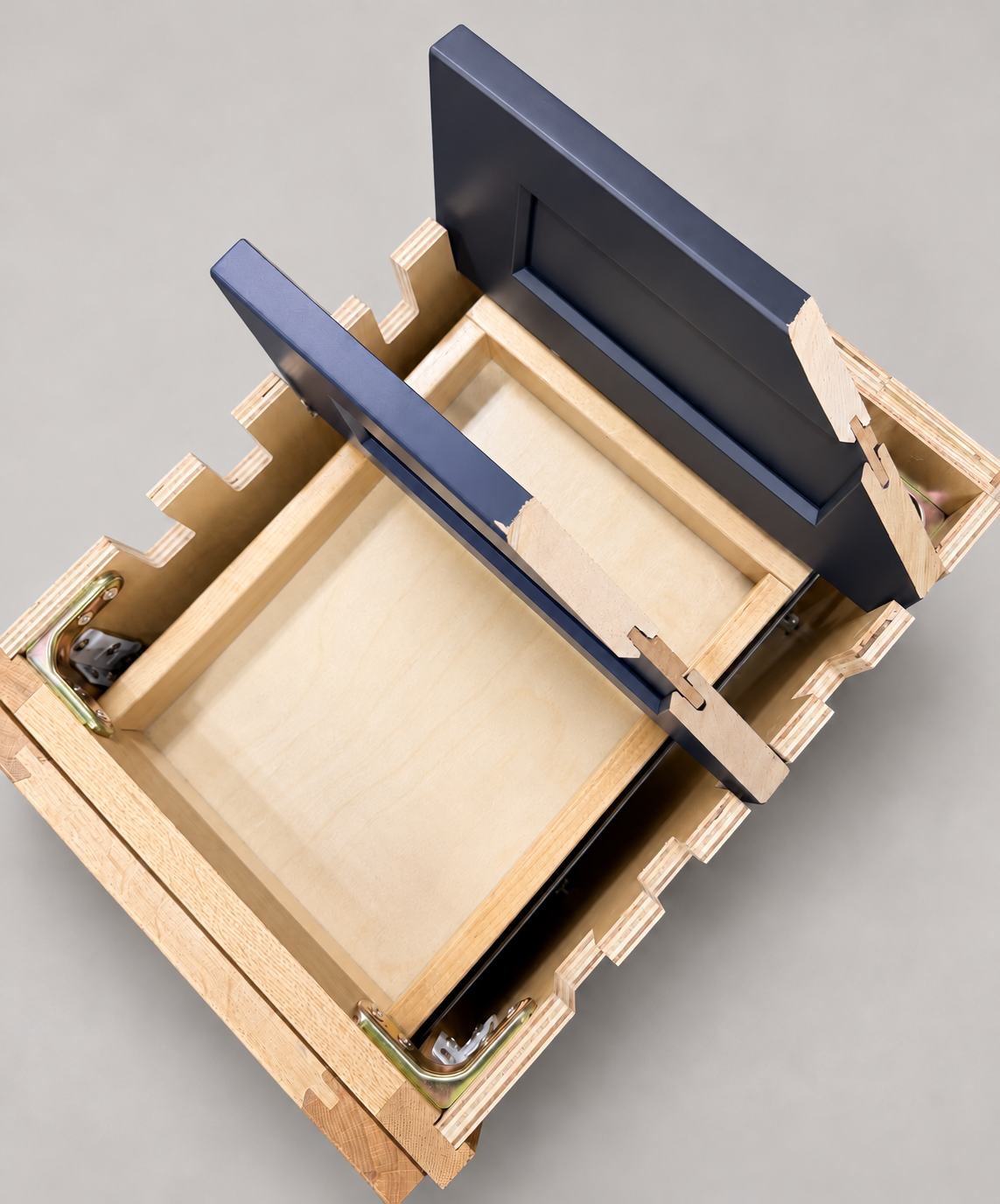
The sample shows the door frame, a separate center panel, the face frame and the cabinet box. Each component has its own place in this Shaker construction.
Shaker construction: door frame, center panel, face frame and cabinet box. The cutaway helps locate these parts; confirm each material in the specifications for the selected cabinet.
01 / Door frame
The Shaker door has rails and stiles around a separate center panel. The frame and center panel are different components; confirm their materials in the specifications for the selected cabinet.
02 / Face frame
The face frame surrounds the opening at the front of the cabinet box and sits behind the doors. The face frame, door frame and cabinet box are separate parts.
03 / Cabinet box
The sample exposes the cabinet sides, interior surfaces and layered edges. The image does not establish the wood species or material specification of a selected cabinet.