If a cabinet and backsplash combination feels too busy, do not change the cabinet color immediately. Look at the repeated lines: door frames, tile edges, grout, handles and any strong pattern within the tile. Several restrained choices can create a forceful combination when repeated together. A useful comparison identifies which element should lead and which can become quieter.
Decide what the room should draw attention to
Begin with the feature you are least willing to lose. It might be a patterned backsplash already selected, a particular cabinet profile or a view through a window. Give that feature a clear role in the composition. This is a preference-setting exercise, not a rule that only one attractive material is allowed in a kitchen.
List what is fixed and what can still change. If the backsplash is already installed, its layout and grout are real constraints. If it is only an inspiration image, those choices remain open. Do not downgrade a preferred cabinet based on a photograph of tile that will not actually be used. Build the comparison from identified materials and a representative arrangement.
A single tile is not the installed pattern
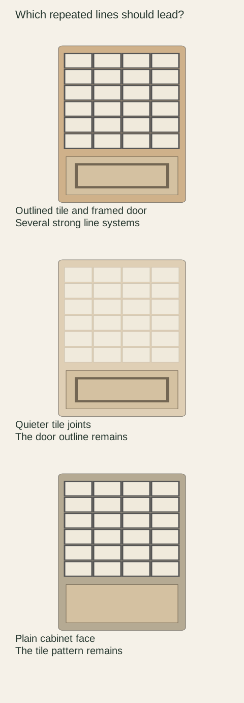
Fireclay Tile explains that contrasting grout emphasizes tile layout, while a closer color relationship produces a different visual effect. Its guidance is a reminder to include grout in a design comparison; suitability and installation requirements still belong to the selected tile and grout products.
Diagram Pattern relationships only. These sketches do not specify tile spacing, grout suitability, cabinet dimensions or actual materials.
Ask for a sample arrangement that shows enough repeats to understand the proposed layout. Include the intended orientation and a representative grout treatment through the tile supplier's recommended sampling process. A loose tile on the counter cannot show the pattern created by many joints. Do not invent joint dimensions simply to make a mockup appear calmer than the intended installation.
Put the door and tile in their actual relationship
Stand the tile sample vertically behind the cabinet sample and keep the door upright. Include a countertop reference at its intended horizontal plane when it is part of the selection. View the group from the room entrance and from the working position. A flat pile of samples can hide the vertical repetition that will dominate the finished wall.
Use a complete door profile, including its inner edge and outside frame. If the order includes small drawer fronts or a different drawer style, show those as well. The relevant question is how the lines repeat across the actual cabinet arrangement. A large single door can make a detailed style look more restrained than a tightly divided bank of drawers.
Identify where the contrast comes from
Look separately at tile shape, joint contrast, color variation within tiles and the cabinet's profile shadows. Add the hardware outline after those elements are understood. A pale palette can still carry strong pattern, and a darker cabinet can be visually simple. Color lightness alone does not explain how active the group feels.
Describe the concern concretely: dark tile joints compete with the door border, repeated diagonal lines distract from a narrow framed cabinet, or hardware creates another strong rhythm. A precise observation suggests a useful next test. Saying that the room needs to be more timeless usually produces another collection of unrelated samples without resolving the conflict.
Run a comparison that changes one thing
Keep the cabinet color and hardware constant while comparing a simpler door profile, if such an option is available. Alternatively, keep the door and tile constant while comparing supplier-supported grout colors. The aim is to discover which change improves the relationship. Changing the cabinet, countertop and tile together gives no clear answer.
You may find that a lower-contrast joint makes the preferred cabinet work. Or the tile pattern may be the feature you want to keep strong, making a quieter cabinet front the better choice. Neither result requires declaring framed doors incompatible with patterns. The decision belongs to the particular materials, amount of repetition and viewpoints in this room.
Design study This design study helps identify competing line systems around the cabinets. It does not establish a tile product, material suitability or a supplied installation.
Check the upper edge and the interruptions
Locate where the backsplash ends at cabinet sides, the hood area and any open shelves. Those boundaries can make the pattern feel contained or scattered. Include outlets and other visible interruptions in the sketch, even if their final details require another professional's coordination. A perfectly uninterrupted sample panel may not represent the actual wall.
Review the shape of the exposed pattern area before adding more decorative detail. A narrow strip between a tall cabinet and a doorway may show only fragments of a large motif. Ask the tile designer or installer to review the real layout rather than assuming an attractive central sample will remain recognizable at every edge. The cabinet plan and tile plan need to describe the same wall.
A worked example with outlined pale tile
Imagine pale rectangular tile with conspicuous dark joints behind cream framed cabinets. The homeowner likes both materials separately but finds the combination restless. Changing the cabinets to another pale color leaves the same network of repeated dark lines. The original concern was not resolved because the pattern structure remained.
A better comparison keeps the cabinet sample and tests a compatible quieter grout option through the tile supplier. Another keeps the strong tile outline and compares a simpler cabinet profile. Add the same handle proposal to both. The household can then choose the feature it wants to emphasize, with a clear record of what changed and why.
Keep taste decisions separate from installation suitability
An attractive sample does not establish that the tile, grout or setting system is suitable for the location. Confirm those requirements through the actual product guidance and the responsible installer. Do not use a design mockup to override installation instructions or claim that a cabinet supplier is providing the surrounding surface work.
Likewise, a quieter visual effect does not automatically mean easier maintenance. Keep cleaning and material suitability in their own review. This article's task is to help coordinate visible detail. A final selection needs both an appearance that the household likes and an independently confirmed material and installation specification.
Approve the relationship rather than isolated swatches
Retain the identified door sample, tile arrangement, grout selection and hardware proposal together. Add a simple elevation showing the pattern boundaries and the cabinet-front divisions. If any one of those changes, review the combination again instead of assuming the previous approval carries over unchanged.
Before installation, compare the supplied materials with those records and resolve unexplained substitutions. Keep a photograph of the approved physical arrangement for orientation, while recognizing its color limits. The useful outcome is a composition you can describe and reproduce: which repeated lines remain strong, which recede, and where the pattern is meant to stop.
Pure White
Cream White
Light Warm Gray
Gray
Navy
Black
Oak Tone
Dark Walnut Tone
Design study These finish studies are design references, not a list of currently orderable colors. Screens and lighting change the appearance; compare a physical sample before choosing.See all finish options →
A cabinet color that looks warm online can read differently next to your floor. Compare an identified physical sample in the positions and lighting where the cabinets will live.
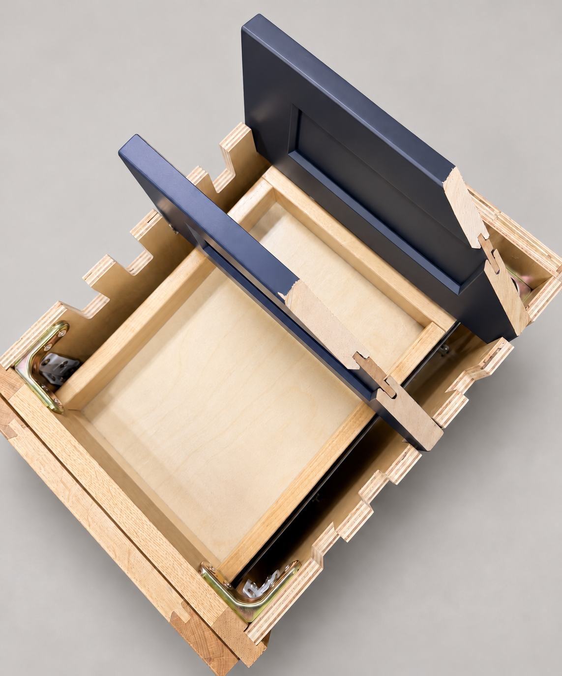
The sample shows the door frame, a separate center panel, the face frame and the cabinet box. Each component has its own place in this Shaker construction.
Shaker construction: door frame, center panel, face frame and cabinet box. The cutaway helps locate these parts; confirm each material in the specifications for the selected cabinet.
01 / Door frame
The Shaker door has rails and stiles around a separate center panel. The frame and center panel are different components; confirm their materials in the specifications for the selected cabinet.
02 / Face frame
The face frame surrounds the opening at the front of the cabinet box and sits behind the doors. The face frame, door frame and cabinet box are separate parts.
03 / Cabinet box
The sample exposes the cabinet sides, interior surfaces and layered edges. The image does not establish the wood species or material specification of a selected cabinet.