Begin with the light you actually have
Take a cabinet sample into the room before choosing the other finishes. Hold it vertically where the cabinets will stand and look at it in morning light, late afternoon and under the planned evening lighting. A sample laid flat on a table tells you less about a cabinet wall than one held in its final orientation.
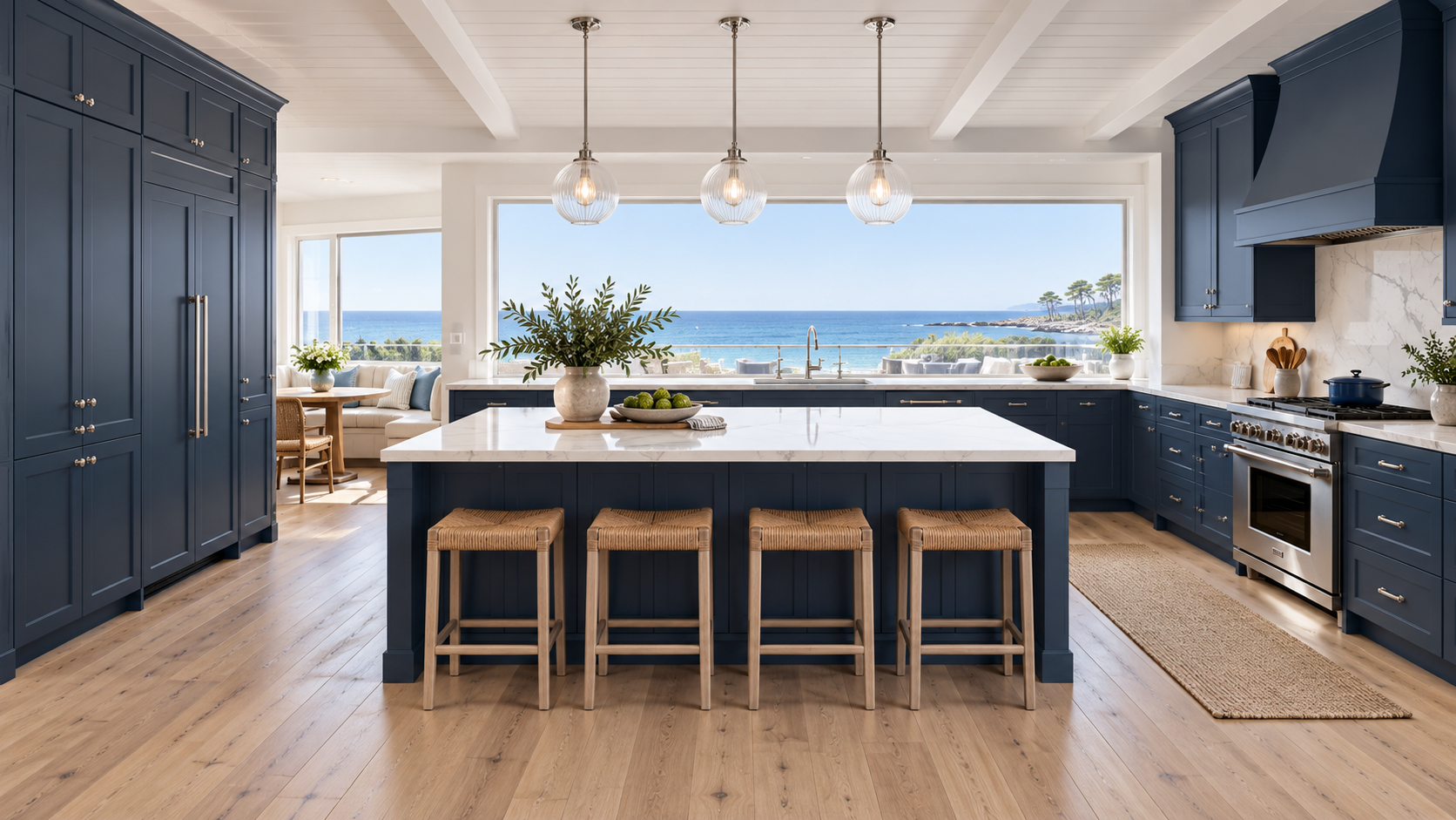
The navy kitchen study uses broad daylight and pale surrounding surfaces to keep the cabinet fronts readable. That is a design choice, not proof that every blue finish will look the same in your home. If your room receives little daylight, test a smaller amount of navy first, such as the island or a lower cabinet run.
Let the countertop set the contrast
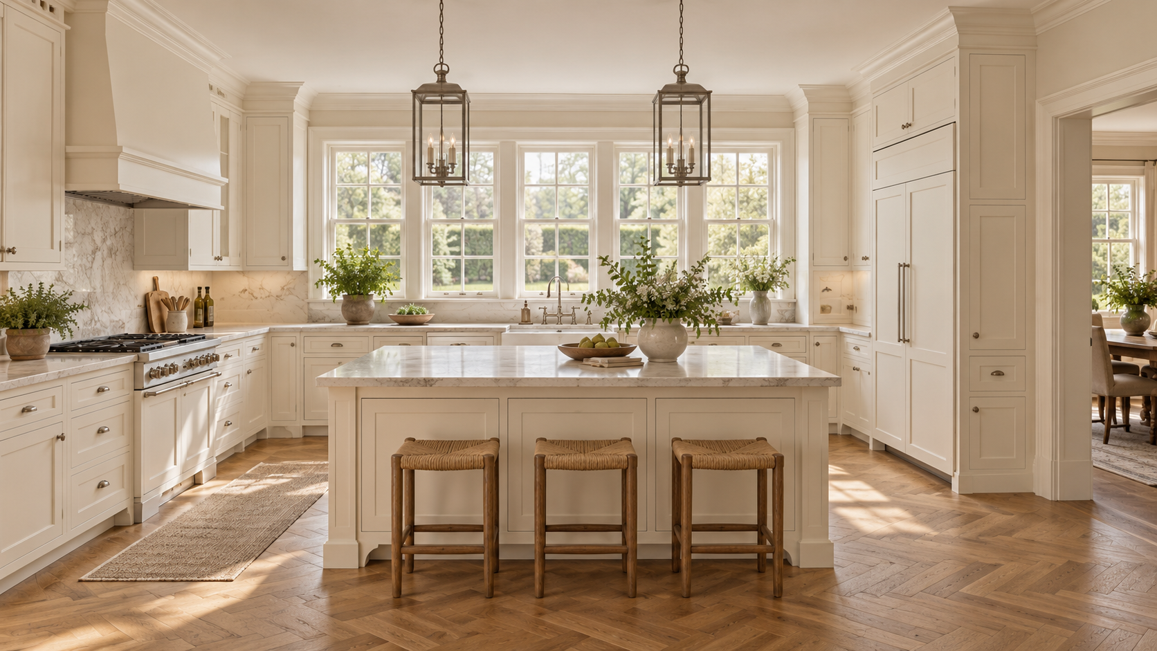
For a crisp pairing, compare navy with a quiet white or pale gray stone appearance. For a softer room, try an off-white surface with restrained warm veining. Place the actual cabinet and countertop samples together rather than comparing separate photographs. A countertop that looks neutral on its own may feel noticeably yellow or blue beside the cabinet.
Decide which surface will carry the strongest pattern. If the stone has dramatic veining, keep the backsplash or surrounding wood calmer. If the countertop is nearly plain, a more expressive wood floor may have room to stand out. Repeating every pattern at full strength can make an expensive material selection feel unsettled.
Use wood where it adds warmth
Wood can enter the room through the floor, stools, shelving or a second cabinet finish. You do not need to add all four. Start with the largest existing wood surface and see whether it already supplies enough warmth. A kitchen connected to a timber ceiling may need fewer wood accents than one enclosed by white walls.
When mixing painted and wood-tone cabinets, give each finish a clear territory. A navy perimeter with a wood-tone island reads differently from an all-navy kitchen with wood seating. Compare both arrangements from the living room as well as from the working aisle. Keep the cabinet profiles and the transitions between finishes intentional.
Treat hardware as part of the composition
A warm metal finish can soften navy; a cooler metal can make the same fronts feel sharper. That is a visual judgment, not a quality ranking. Compare a real handle with the faucet and lighting you intend to use. Similar finishes from different product lines may not be identical, and a deliberate difference often looks better than an almost-match.
Handle length and placement matter as much as color. Review a door, a narrow drawer and a wide drawer together so the arrangement has a consistent rhythm. Try the pull with your hand. A small detail repeated across a full kitchen deserves more attention than its size suggests.
Make one sample board before deciding
Bring the cabinet, countertop, backsplash, flooring and hardware samples together in the room. Remove one element at a time if the combination feels busy. Photograph the group to compare options, but make the final color decision with the samples in front of you.
The website's finish studies are useful for narrowing a direction. They are not a substitute for a physical finish sample or confirmation of the exact cabinet series. Keep the approved sample and the written finish selection with the project documents so everyone works from the same reference.