Choose a wire-brushed cabinet surface with your hand as well as your eyes. A photograph can show grain contrast while hiding how much relief you will feel along the face and edge. Compare the finished sample with a smoother alternative, then decide whether that texture belongs on the surfaces you touch and see every day. Color approval alone leaves this decision open.
Confirm what produced the texture
StarMark describes wire brushing in its Weathered technique as opening the softer grain to create depth and texture. That is a useful example of a physical surface treatment. It does not identify every cabinet sold with a weathered, textured or rustic label.
Ask whether the candidate is brushed wood, an embossed decorative surface or another construction. Record the actual face material and finish system. A printed grain can look convincing, and a real wood grain can still have a relatively smooth coating. The visual pattern and the tactile surface are separate things to observe; neither should be inferred solely from a photograph or a product nickname.
Compare finished surfaces, not workshop stages
A raw textured offcut may help explain the process but is not the finished cabinet surface. Ask for a representative sample after the specified coating has been applied. Inspect its broad face and edges. If the sample is a different material or an unfinished demonstration piece, label that limitation before using it to make a purchase decision.
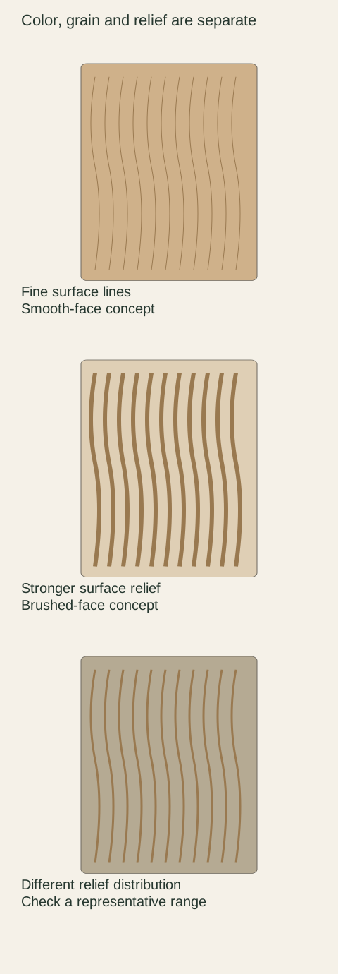
Diagram Conceptual texture drawings. Line thickness is not a measured groove depth, and the diagram does not identify a real material or finish.
Try to compare a smooth and textured option in the same proposed color. Otherwise the darker grain contrast of one may be mistaken for deeper relief, or a pale stain may make a texture appear quieter than it feels. Where equivalent samples are unavailable, keep separate notes about color preference and texture preference. Do not allow uncertainty about one to disappear into a general approval.
Touch the places a hand actually reaches
With permission, run a clean hand over the face and the edge you would normally use. Pay attention to the transition from the flat area to a profile or pull location. Decide whether the surface feels pleasant during an ordinary grip. This is not an invitation to scratch, scrape or press hard enough to test the coating.
A textured center may be largely visual when a handle keeps fingers away from it. An edge-grip design brings the hand into contact with a different part of the front. Review the actual opening method instead of assuming that a comfortable central sample describes the grip. If a rough or catching spot is unexpected, identify its location and ask the supplier to assess it.
Side light reveals a different part of the choice
Place the sample upright where the cabinet will be and look across it under the room's ordinary side light. Then view it more directly. Note whether the relief adds a subtle pattern or a level of contrast you find distracting. A sample that looks quiet on a table may read differently on a tall surface beside a window.
Do not evaluate only under a flashlight held almost against the face. That can be useful for locating a specific concern but is a poor substitute for the room's normal experience. Likewise, a soft studio image may conceal the very texture being selected. Record the normal viewing conditions that affect your preference so another decision-maker can repeat the comparison.
Look across a group, including smooth companions
A door, an exposed end and a trim piece may not receive identical texture treatment. Ask what the selected system provides for each component. Put representative pieces together where possible. A matching stain name does not establish matching relief, and a smooth filler can remain visible beside a strongly brushed front.
Decide whether those differences are intentional and acceptable. A smooth border may provide a useful stopping point; it can also look accidental when the drawing suggests continuous texture. Identify the actual transition on the elevation. Do not write textured throughout unless the provider has confirmed which parts that statement includes and how they are made.
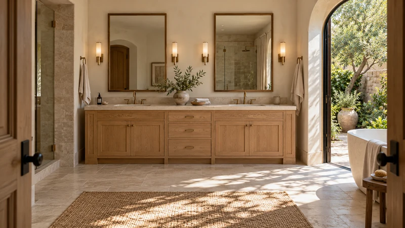
Design study The design study locates a visible wood-tone surface under side light. It cannot prove tactile texture, brushing, surface quality or actual material.
A worked choice for a frequently used island
Imagine an island facing the dining area, with a pale wood finish selected for its calm appearance. A brushed sample looks attractive from across the room. At the opening edge, however, the owner prefers the smoother sample's feel. The useful response is to review the handle or edge detail and the surface assignment, not immediately reject all wood textures.
The final design might keep the brushed finish on a fixed visible panel and choose a compatible smoother front for frequent handling, if those components are available and look right together. It might instead retain the same textured front with a different approved handle. Compare the entire combination before deciding; mixing finishes introduces a new transition that also deserves approval.
Ask for a care method that fits the relief
Read the instructions for the actual finish rather than borrowing a routine from flooring or outdoor weathered wood. Ask how ordinary dust or a small spill should be removed from the textured face. If permitted, follow a clean soft cloth along a sample to understand access. Do not introduce food, abrasive brushes or chemicals as an improvised demonstration.
Texture is not a promise of stain resistance or invisible scratches. A mark across raised areas may be noticeable in a different way from a mark on a smooth face, and any proposed touch-up must suit the coating. Ask what the manufacturer recommends for a small damaged area and when it expects the part to be assessed or replaced. Avoid assuming that a rustic appearance makes repair irrelevant.
Approve the amount and location of texture
Retain a labeled finished sample and record the surface system, material, finish, sheen and affected components. If the offered product has a visible range of relief, review a representative range rather than selecting the calmest piece as the sole control. Describe what was accepted without inventing a numerical roughness tolerance the supplier has never agreed to.
At receipt, compare the labeled front and companion panels before installation or touch-up. Report an unexpected difference with a full view and a close view under comparable light. Separate a changed texture assignment from a particular rough spot or damaged coating. That distinction lets the seller investigate the correct issue and preserves the actual finish choice made during sampling.
Pure White
Cream White
Light Warm Gray
Gray
Navy
Black
Oak Tone
Dark Walnut Tone
Design study These finish studies are design references, not a list of currently orderable colors. Screens and lighting change the appearance; compare a physical sample before choosing.See all finish options →
A color name does not identify a finish system. Compare the decorative surface, the core, the edge and the repair method before choosing a cabinet front.
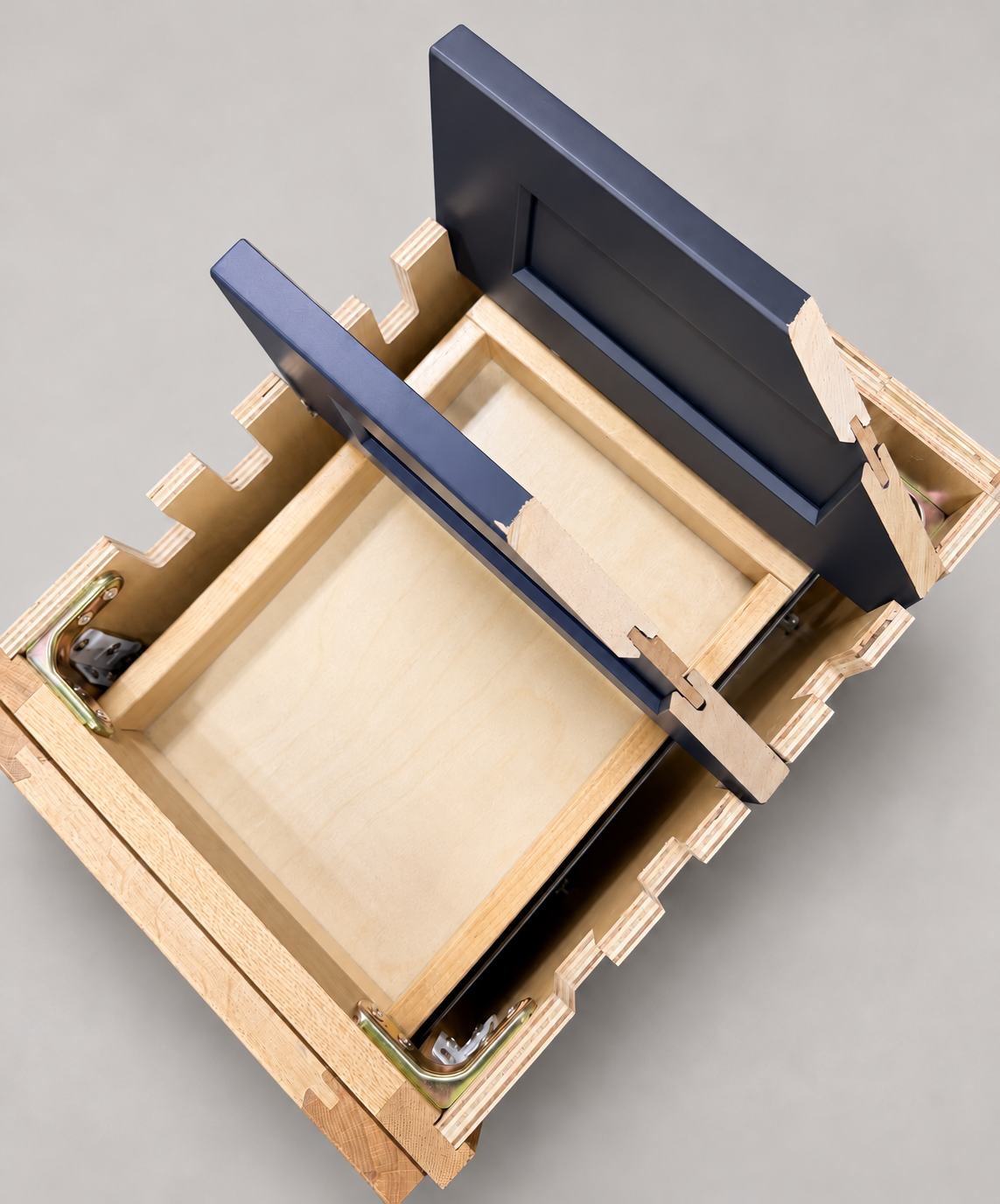
The sample shows the door frame, a separate center panel, the face frame and the cabinet box. Each component has its own place in this Shaker construction.
Shaker construction: door frame, center panel, face frame and cabinet box. The cutaway helps locate these parts; confirm each material in the specifications for the selected cabinet.
01 / Door frame
The Shaker door has rails and stiles around a separate center panel. The frame and center panel are different components; confirm their materials in the specifications for the selected cabinet.
02 / Face frame
The face frame surrounds the opening at the front of the cabinet box and sits behind the doors. The face frame, door frame and cabinet box are separate parts.
03 / Cabinet box
The sample exposes the cabinet sides, interior surfaces and layered edges. The image does not establish the wood species or material specification of a selected cabinet.