
Design & industry
Neolith THE EDIT: the new surface and finish have to be chosen together
The September introduction combines different patterns with Honed, Petra and Natural Touch finishes. Compare a complete material expression at the horizontal top and vertical face, rather than treating the launch as interchangeable colors.
Neolith's THE EDIT introduction is useful to a kitchen buyer because it puts several different surface expressions inside one release. The decision is not simply which new color looks best on a screen. Choose the actual design and its offered finish together, then decide which parts of the kitchen should carry it. A horizontal island and an upright backsplash can reveal different aspects of the same selection.
Neolith announced THE EDIT on September 29, 2026. Pale Fossil’s ivory fossil pattern contrasts with Calacatta Viola’s burgundy-purple veins. The Verona introduction also includes Glazed Opaline, Dorset Mist and Serene Emerald.
Reading note: Neolith: THE EDIT surfaces announcement, September 29, 2026.
A launch contains different physical offers
The official program pairs Pale Fossil with Honed, Dorset Mist and Serene Emerald with Petra, and Glazed Opaline and Calacatta Viola with Natural Touch. These finish assignments belong to the named surfaces, rather than representing a free choice of any finish on every design.
Reading note: Neolith Group: THE EDIT program.
That is the practical starting point. If you like a design in a particular presentation, ask to see that design in the finish actually proposed. Do not compare a photographed pattern from one surface with a tactile sample from another and assume you have approved the combination. The offer needs to bring both preferences into the same physical sample.
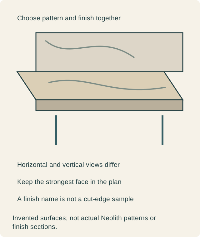
See the top in its working plane
Put the candidate horizontally beside the actual cabinet reference. Walk around it and look from the ordinary preparation position. Light across the top may emphasize a surface treatment differently from light falling on an upright showroom board. The point is to see your preference under useful conditions, not to infer a universal performance difference from a reflection.
Include the objects that will occupy the counter. A board, tray or appliance may interrupt the part of a pattern that attracted you. Decide whether the remaining visible areas still carry the desired effect. A kitchen used every day will not reproduce a photograph showing an entirely clear island.
Give the upright field its own review
A backsplash or island end puts the material closer to a wall-like reading. Examine it from the room entrance and beside the neighboring doors. The selected surface can become a focal point there even if it felt quiet as a small horizontal sample. Conversely, a design selected for movement may lose much of that movement in a short strip.
Keep the candidate's actual plane and coverage explicit in the comparison. You can choose the new material on an island and retain a different wall treatment. You can also use it on an upright feature without extending it across every working surface. The release provides alternatives; it does not require an all-over installation.
Compare composition without adopting a mood promise
The manufacturer organizes this program around expressive ideas. A buyer can use that as a prompt to discuss preference, but the real test remains the visible arrangement. Describe what you like: a quieter field, a concentrated feature or a direction that leads across the island. Those observations can be checked against a sample and drawing.
Avoid treating the collection's emotional vocabulary as a promised effect on everyone who enters the room. Household preferences can differ. One person may enjoy a conspicuous surface while another wants the cabinets to remain the main feature. Review the actual proposals together and decide what should draw attention in this kitchen.
Texture and printed depth are different questions
A surface can suggest depth through its graphic while also having a particular tactile finish. Ask to see and, where permitted, touch the finished example. A close photograph cannot establish the physical relief your hand will encounter. Nor does a tactile finish name explain what the cut edge will show.
For an exposed front or sink opening, use an example of the selected product and fabrication. Do not transfer an edge approval from another design simply because both belong to this release. The face, exposed body and any separate built-down edge form one visible countertop, and each should be understood before the selection is finalized.
A hypothetical room limits the new surface
Imagine owners considering the introduction for both an island and a full-height wall. They like the sample's texture, but the full composition makes the wall compete with a retained cabinet elevation. They compare the same chosen design on the island only, keeping the remaining material references unchanged.
The island proposal preserves the new surface where they approach and use it, while the wall becomes quieter. They accept that allocation because it makes the feature legible from the entrance without asking every plane to repeat it. The decision changes coverage, not the reason they liked the material.
Another household may prefer the continuous material field. Its comparison should still show the actual pieces and separations. A consistent color name does not make a wall, top and island end one unbroken object. The selected layout must explain the joints rather than hiding them behind a continuous-looking rendering.
Keep the fabrication discussion specific
The responsible fabricator should identify the material format, support, openings and edge arrangement for the project. This article does not derive technical limits from a launch photograph. A new finish assignment is not permission to reuse every detail from a previous countertop in a different product.
If the preferred surface requires a changed edge or coverage, compare that complete proposal with the alternative you already liked. The useful question is what the change gives this room. There is no need to replace an accepted existing selection merely because the collection is newer.
Make the introduction useful to the final choice
Record design, finish, intended planes, approved appearance examples and the proposed piece layout together. Project supply belongs to the supplier's current offer, separate from the publication date. A later substitution should identify which visual and fabrication decisions need another review.
THE EDIT earns a place in the project when a specific new surface and its finish create the result the household wants. The purchase is clear when everyone can point to the actual top, upright faces and exposed edges that were selected, rather than only to an appealing collection name.
Sources & further reading
- Neolith: THE EDIT surfaces announcement, September 29, 2026
- Neolith Group: THE EDIT program