Behind glass cabinet doors: match the interior or choose a contrasting backdrop?
The back, sides and shelf edges become part of the kitchen when the doors are transparent. Compare the complete interior with your dishes before paying for a finish that only changes the rear panel.
A glass-front cabinet exposes more than its dishes. The back, sides, shelves and their edges become part of the room's visible color scheme. Choose the interior with the door and the actual collection, rather than assuming the cabinet's exterior finish continues automatically behind the glass. A matching interior can make the enclosure feel continuous; a contrasting one can give the contents a distinct background. Neither choice is automatically the more expensive or better-made cabinet.
Matching interior is an order detail, not a visual assumption
KraftMaid Momentum describes its matching-interior option as affecting the end panels, shelves, floor, ceiling and back. That manufacturer example shows why the scope extends beyond a colored rear panel.
KraftMaid's FAQ identifies matching interiors on glass-door cabinets as standard within its Vantage line. Inclusion depends on the actual line; do not assume it is always an upgrade or always included.
For the cabinet being quoted, identify the interior finish separately from the door finish. Ask which surfaces receive it and how exposed shelf edges are treated. A rendering may color every surface alike while the priced product retains a different shelf front or interior side. Resolve that difference on the selected construction before approving the appearance.
Matching color does not prove matching material. A wood-looking interior can use a different surface from the stained door. A painted-looking interior is not necessarily the same coating as the front. Keep the material description and care instructions alongside the color selection, without treating a visually coordinated interior as evidence of a particular core or durability rating.
Put the real collection against each background
Compare the same dishes in both alternatives. An empty dark cabinet can look dramatic, but it does not show how the household's dark mugs will read inside it. A pale interior may separate those shapes more clearly, while a collection of white serving pieces may stand out against a darker background. These are observations to test with the objects, not universal color rankings.
Include the number of pieces normally stored there. A display arranged with a single decorative bowl can flatter almost any background. Once the ordinary stack of plates and the drinking glasses return, the balance can change. If the preferred photograph depends on storing half the collection somewhere else, identify that other storage before choosing the finish.
Look through the selected glass, not only into the open cabinet. Texture, reflections and the door divisions affect the visible result. Keep the glass and lighting unchanged while comparing interior colors so a clearer insert or a brighter lamp does not get mistaken for a better background. The relevant result is the cabinet as it will normally be seen.
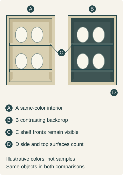
Teaching example Two conceptual display interiors hold the same light dishes. A continues the frame color inside; B uses a contrasting interior. C identifies visible shelf fronts and D the side and upper interior surfaces. Door glass is omitted for clarity; these colors are not ordering samples or a lighting simulation.
The shelf front can interrupt an otherwise quiet interior
Trace the visible horizontal edges. A different shelf-front color may create a line across every level, even when the back is carefully matched to the doors. That can be an intentional detail, but it should not first appear when the delivery cartons open. Include the shelves, exposed edges and supports in a representative view.
If glass shelves are proposed, compare them as a separate component choice. They alter the visible lines and the way lighting reaches the contents, but require their own appropriate support and load information. Do not remove an opaque shelf from the rendering simply to make the interior look uninterrupted while leaving it in the order.
Open the door as well. The back of the door and retaining pieces may become visible during use. They do not always belong to the same interior option. A matching rear panel cannot answer what the open door looks like, and a stain name cannot establish that all visible pieces receive the same surface treatment.
A pale collection changes the preferred background
Consider a hypothetical kitchen with light cabinet fronts and a small group of glass-door cabinets beside the dining area. The owners intend to display white serving pieces they actually use. The ordinary mugs and everyday mixed dishes already have a complete home in closed storage, so this display does not depend on hiding an unassigned overflow.
The first proposal continues the light finish inside. In the completed sample view, the serving pieces and rear surface form a very quiet field. The owners like the calm appearance but find it difficult to distinguish the shapes from the dining table, which is the viewpoint that matters to them.
They compare a supported contrasting-interior option with the same glass, shelves, lighting and serving collection. The darker background makes the outlines more distinct in that actual comparison. They inspect the side surfaces and shelf fronts too, rather than accepting a sample consisting only of a dark board propped behind the dishes.
They select the complete contrasting interior for the display cabinets and retain the ordinary specified interiors behind the opaque kitchen doors. The final order identifies the affected cabinets and surfaces. No one assumes that the contrasting material can be applied to every cabinet in the chosen line, or that choosing it changes the construction of the rest of the kitchen.
Another household may prefer the quiet light-on-light arrangement. That remains a valid result when the contents and viewpoint have been tested. The aim is not maximum contrast everywhere; it is a cabinet whose visible interior supports the way the owners want to see and use their collection.
Approve appearance without losing maintenance and access
Keep everyday cleaning and retrieval possible in the selected display. A backdrop that looks good only when objects are packed tightly against the rear wall can become awkward to maintain. Check the permitted shelf positions and space to grasp a serving piece without moving an unrelated group. The color choice does not resolve physical access.
Use care guidance for the actual interior surface. Do not infer that a dark interior hides every mark or that a pale one is stain resistant. Similarly, adding an adhesive liner or repainting a factory interior later is a separate material decision, not an automatic way to correct an incomplete initial selection.
If lighting is included, review the complete illuminated sample and the lights-off appearance. A backboard judged under a sales display's lighting may look different in the kitchen. The wiring, shelf arrangement and maintenance access must belong to the accepted cabinet package; a colored backdrop should not be used to conceal unfinished service decisions.
Keep the scope visible in the quote
Compare the complete cabinet prices with the same door, glass, shelf arrangement and hardware. Identify any interior-finish difference and the specific surfaces it changes. If one line includes matching interiors and another prices them separately, compare the completed assemblies instead of ranking the word upgrade.
Retain an accepted view or sample record showing the collection against the chosen interior, together with the actual finish identity. At delivery, confirm those surfaces before filling the cabinet. Glass doors make an interior omission part of the room's appearance every day; settling it before ordering is easier than trying to disguise a different cabinet afterward.
Pure White
Cream White
Light Warm Gray
Gray
Navy
Black
Oak Tone
Dark Walnut Tone
Design study These finish studies are design references, not a list of currently orderable colors. Screens and lighting change the appearance; compare a physical sample before choosing.See all finish options →
Choose display lighting with the shelves and dishes in place. Compare a top fixture, lighting for separate shelf spaces and decorative glass-edge effects before the cabinet is fabricated.
Choose antiqued mirror for the reflected scene and concealed storage you want. Compare the full door group, its patterned surface and the view when it opens before replacing transparent glass.
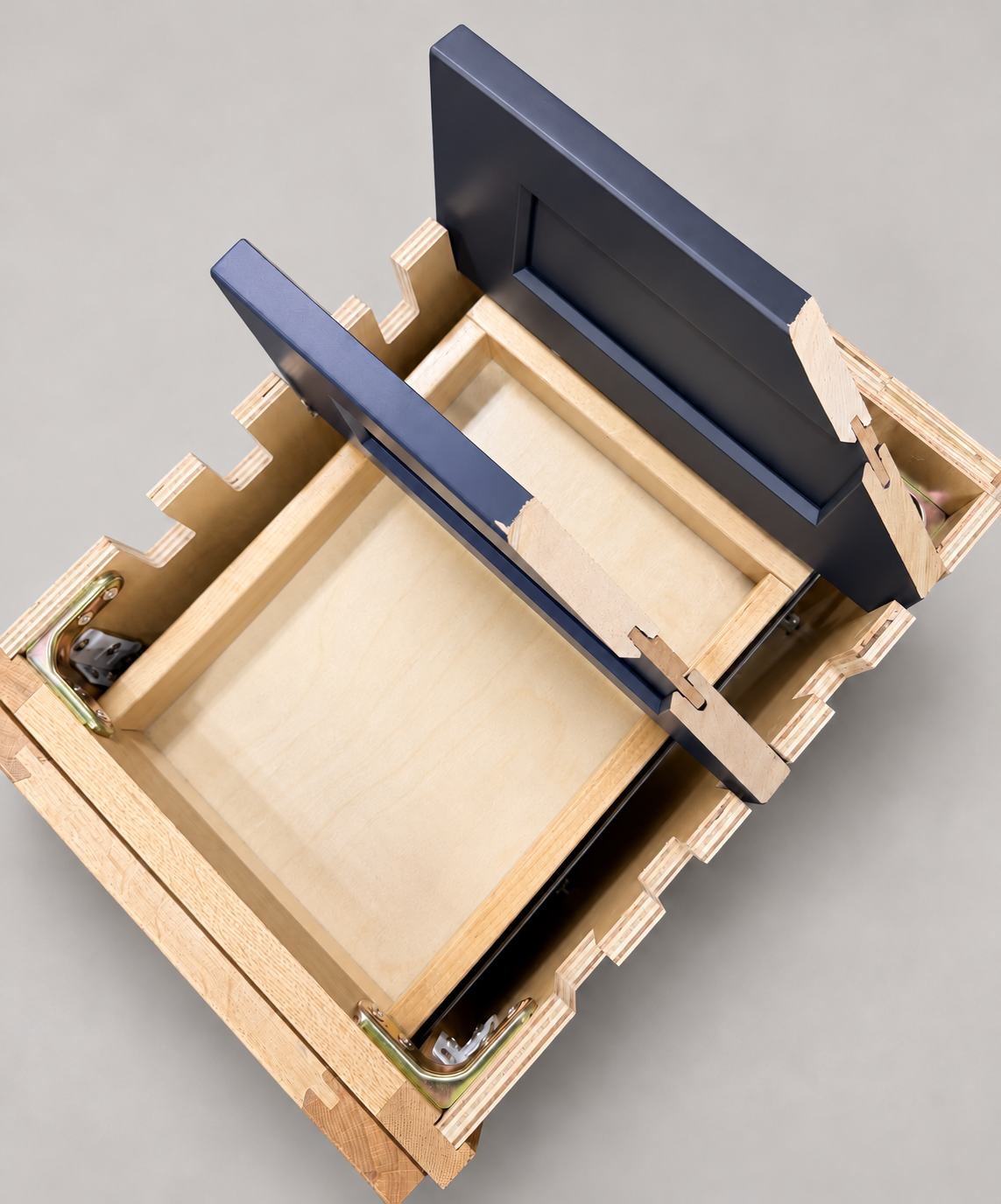
The sample shows the door frame, a separate center panel, the face frame and the cabinet box. Each component has its own place in this Shaker construction.
Shaker construction: door frame, center panel, face frame and cabinet box. The cutaway helps locate these parts; confirm each material in the specifications for the selected cabinet.
01 / Door frame
The Shaker door has rails and stiles around a separate center panel. The frame and center panel are different components; confirm their materials in the specifications for the selected cabinet.
02 / Face frame
The face frame surrounds the opening at the front of the cabinet box and sits behind the doors. The face frame, door frame and cabinet box are separate parts.
03 / Cabinet box
The sample exposes the cabinet sides, interior surfaces and layered edges. The image does not establish the wood species or material specification of a selected cabinet.