
Design & industry
Dura Supreme’s 2026 finish expansion: choose grain contrast or an artisan brown treatment
The new Cerused collection and refreshed brown Artisan offerings change different parts of the wood appearance. Compare the actual completed treatments before treating the introductions as interchangeable shades.
Dura Supreme’s spring finish announcements offer two related reasons to revisit a wood-cabinet palette: a new Cerused treatment that emphasizes grain, and an expanded brown-stain and Artisan program. They should not be reduced to a larger stack of similar brown chips. The buying decision is which treatment should carry the room’s visual character, on the actual wood and front family being offered. Start there before choosing a color name.
Dura Supreme’s news index dates the Cerused announcement 2026-03-18 and the stain/Artisan refresh 2026-04-14.
Reading note: Dura Supreme News: dated Cerused and artisan-finish announcements.
These are publication dates, not project availability or delivery commitments.
The Cerused addition puts the grain in the foreground
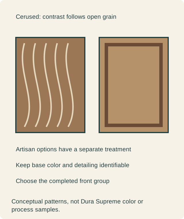
The Cerused release identifies quarter-sawn white oak and hand-applied contrasting pigment in its open grain after stain and sealer. That names a particular wood-and-treatment offering.
Reading note: Dura Supreme: new Cerused Artisan Finish Collection.
For a buyer, this is a different effect to inspect from a plain brown field. Look at the grain lines and the surrounding background separately. Decide whether the contrast is the detail you want to see from the dining area, and whether that detail supports the chosen door form. A darker or lighter overall photograph cannot explain the relationship between the grain and its background.
Review grain direction on the component group as well. A narrow drawer, a broad center and the rails around it can present different portions of the wood drawing. When contrast is the reason for the finish, those proportions become part of the result. Ask for the actual front arrangement rather than expecting a tiny sample to repeat at every scale. A design may deliberately keep a narrow companion plain to give the grain-focused field room, but that changes the surface assignment and should be visible on the elevation.
The wood choice belongs in the comparison. Quarter-sawn white oak is part of this named release, rather than a generic instruction to apply the same appearance to any door material. Ask the supplier to present the intended front and its companion parts in the actual offered treatment. Do not assemble a preference from one wood sample and another finish image unless that combination has been confirmed.
The brown refresh offers another appearance route
The spring refresh introduces Whiskey Barrel and Desert Sand stains, alongside new Stain/Glaze, Heirloom and Patina combinations. These are specific additions to the manufacturer’s finish program.
Reading note: Dura Supreme: stain portfolio and artisan collection refresh.
Compare a plain stained sample with the offered decorative versions on the same front family where possible. The useful difference may be in the broad field, the way profiles gain emphasis or the overall impression of age. Do not treat all of those as stronger doses of the same brown. A decorative treatment can change the room’s pattern even when the underlying color family remains related.
This also clarifies the role of the new stain names. Choose a base color because it works beside the floor and countertop, then evaluate the complete version with its selected detailing. If the plain sample works and the decorated one does not, the problem may belong to the treatment rather than the color. Rejecting every brown option at that point would erase a useful distinction.
Hand finishing needs an accepted range, not a perfect duplicate
Ask the provider to show representative finished pieces as a group. View their variation at normal room distance before examining the close details. A single especially restrained sample may not show the full character of an offered hand treatment. The owner needs to decide what degree of variation is welcome and confirm that the examples represent the selected product.
Keep this discussion practical. An artisan label does not make an unexpected result automatically acceptable, and an owner should not require a hand-treated surface to reproduce one small mark mechanically on every front. Use the actual examples to establish the character being purchased. Avoid inventing an application tolerance or a universal definition of light distressing that the supplier has not agreed to.
Compare the whole elevation before combining treatments
Place the proposed fronts, exposed end and visible trim together. A grain-focused field and a heavily detailed profile can compete when repeated across many adjacent components. Alternatively, a limited grain accent can work well with quieter companions. Decide where each effect begins and ends on the drawing. The same base-color family does not make every surface transition disappear.
Also compare the final appearance with the intended hardware. A strong pull outline, dark profile detail and contrasting wood grain may create more pattern than the first small sample suggested. You can preserve the preferred treatment while simplifying another element. The objective is an accepted composition, not a demonstration of every finish technique available in the expanded program.
A hypothetical island chooses the Cerused direction
Imagine an owner who wants a wood island to be visibly distinct from painted perimeter cabinets. The attraction is the oak grain, while the overall room should remain restrained. A completed Cerused trial makes the grain readable in a way the owner prefers. A separately reviewed brown Artisan trial adds a different detailed character that competes with the existing backsplash.
The owner selects the demonstrated Cerused island group and keeps the painted perimeter. Its exposed end is reviewed with the doors, so the grain emphasis does not abruptly change at the corner. This hypothetical choice uses the new program for a specific design purpose. It does not claim that Cerused is always more subtle or that any named brown treatment produces the same result in every room.
If the owner instead wanted the decorative profile treatment to be the main feature, the Artisan trial could be the stronger choice. Another design could prefer the plain stained front. These are useful alternatives within the expanded discussion. They should be compared as completed surfaces rather than arranged into a hierarchy in which the most complicated finish automatically wins.
Confirm the selected combination and preserve its identity
Request the actual wood, front family, finish designation and companion components in the current proposal. The release explains what was introduced; it does not establish every available combination or the seller’s current schedule. A similar name in another collection is not enough to transfer the sample approval. Keep the chosen package tied to its documented identity.
Retain the representative finished pieces and the elevation assigning their locations. For later additions or replacements, compare the new work with the installed group rather than expecting the original name to recreate every natural and hand-applied variation. The important result of these announcements is a more deliberate finish choice: grain contrast where it has a task, brown color where it fits, and decorative treatment only where its completed appearance belongs.
Sources & further reading
- Dura Supreme News: dated Cerused and artisan-finish announcements
- Dura Supreme: new Cerused Artisan Finish Collection
- Dura Supreme: stain portfolio and artisan collection refresh