
Design & industry
Dekton ARTIK NODES and NOMAK: comparing surface patterns
The North American introduction offers connected, fractured graphics beside restrained veining. Compare where each composition will remain visible, rather than choosing solely between pale color chips.
Cosentino's joint ARTIK NODES and NOMAK announcement gives a buyer a useful contrast inside the same surface brand. One direction asks you to notice a structured graphic; the other offers a more restrained field. The purchase decision is where that difference belongs in the actual kitchen. Small pale swatches can hide it, especially when the material will cover a broad island or continue onto a wall.
Cosentino's U.S. announcement, published July 8 and updated July 30, 2026, introduces ARTIK NODES and NOMAK to the regional portfolio. It identifies ARTIK NODES with the United States and Canada and notes NOMAK's earlier EMEA introduction.
Reading note: Cosentino USA: two new Dekton collections, July 8, updated July 30, 2026.
A node is different from an isolated vein
The current ARTIK NODES page describes irregular veins connected at nodes. Its current examples include diffuse white INUK, ivory pink-tinged BOREALIS and pearl-gray NORDAL with warm copper-toned lines. These are distinct graphics within the program.
Reading note: Cosentino USA: ARTIK NODES.
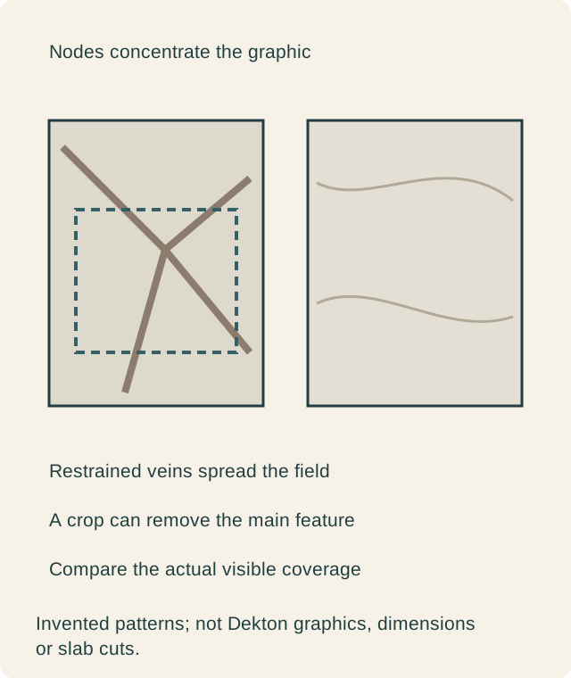
That connected structure can matter more than a general description such as white stone look. A crop may preserve a junction that gives the surface its character, or leave only short isolated lines. Look at the actual visible area instead of assuming the smallest sample communicates how the broad field will read.
For a long island, compare the whole proposed top from the room's main approach. If a strong junction appears near a sink or another opening, decide whether the remaining composition still appeals. This does not make the opening wrong. It reveals whether that particular portion of the material delivers the feature you intended to buy.
Restrained movement is another positive choice
NOMAK's current page identifies ash-gray EVOK, soft-white KEENA with gentle golden veins and ivory THALA with sand-toned veins. The program emphasizes restrained movement across larger planes, rather than the node-centered graphic of ARTIK NODES.
Reading note: Cosentino USA: NOMAK.
A quieter surface is not merely a fallback after rejecting a dramatic one. It may let the household keep another feature, such as figured cabinet doors or a view through the kitchen. Evaluate whether its remaining movement is enough to avoid a flat appearance you dislike, without demanding that every surface become a focal point.
A broad sample and the actual room reference are important here too. Restrained does not mean featureless, and a pale background does not guarantee agreement with the existing floor. Compare the selected design beside the fixed materials instead of choosing a new cabinet white simply because its name sounds compatible.
One room can carry different amounts of graphic
Hold cabinet fronts and the surrounding room constant while comparing the collections. Start with the same proposed top area. Then consider whether extending it vertically improves the room. If both the product and its coverage change in every image, you cannot tell which decision produced the preferred result.
A nodal field might be most useful on a generous uninterrupted face. A restrained field might support several adjoining planes without becoming the feature. Those are possibilities to examine, not promises attached to the collection names. A small but strongly visible patch can still draw more attention than a larger quiet surface.
Do not confuse printed continuity with one piece
If you want material to continue from the top onto a backsplash or end, show the actual piece arrangement. A collection described around continuity does not eliminate joints or determine which pattern sits next to which. The fabricator still needs to prepare the specific proposal.
An intentional change of direction can be acceptable. A buyer may prefer the vertical piece to have its own composition rather than attempt a weak imitation of a fold. Decide that visually before treating a continuous-looking rendering as a fabrication instruction.
Current product identity matters within the news
The dated release and current program pages serve different purposes. The release documents what was announced at that time; the current product description identifies the option being considered now. Do not infer that two different names in different materials are the same item or a verified renaming.
The practical response is to attach the accepted sample and exact product identity to the proposal. This is especially relevant when comparing photographs saved at different dates. A familiar collection heading is not sufficient to preserve the chosen background and graphic.
A hypothetical island keeps the quiet field
Imagine owners with strongly figured cabinet doors and a generous island. They initially favor a nodal surface because its large image is striking. In the room comparison, the strongest feature competes with the cabinet grain, while the appliance opening removes part of the connection they liked.
They compare a restrained candidate over the same area. Its softer movement lets the existing cabinet feature remain clear. They choose that surface for the island and keep their original wall treatment. The new program is useful because it supplies a materially different visual direction, not because every design must appear in one kitchen.
Another household could simplify the cabinets and keep the stronger surface. That is a larger design change and should be compared as such. Neither result establishes a general rule against bold patterns; each gives the material an understandable role in the particular room.
Keep texture and edge questions separate
The graphics do not answer every tactile or fabrication question. Review the offered finish and the completed exposed edge for the actual product. A pale face with quiet movement can still have an edge appearance you need to see. A stronger face is not proof that its pattern continues identically through every cut.
For use and care, keep the manufacturer's instructions for the selected surface. This article does not adopt broad performance or maintenance promises from the launch. The visual comparison is valuable without turning a collection introduction into a claim that the material removes every ordinary care task.
Buy the selected composition
Retain design, finish, coverage and the approved piece arrangement together. If the cabinet layout changes, reconsider the exposed crop rather than preserving a sample approval that no longer represents the visible top. The same applies when a surface substitution changes the graphic.
The choice becomes clear when the buyer can say whether the kitchen needs a concentrated structure or a quieter supporting field, and point to the actual surfaces that deliver it. That is the substantive consequence of this joint release, beyond adding more pale names to a sample rack.
Sources & further reading
- Cosentino USA: two new Dekton collections, July 8, updated July 30, 2026
- Cosentino USA: ARTIK NODES
- Cosentino USA: NOMAK