
Design & industry
Cambria’s August 2026 quartz release: quiet veins, broad waves and a raised-alloy choice
Quintessa, Merivale, St. Loxley and Wyncrest offer different ways to introduce movement. Wyncrest in Cambria Satin also makes texture part of the decision, so the useful review includes both the whole pattern and the hand.
Cambria’s late-summer quartz introduction gives buyers a useful range within a single release: relatively restrained veining, a more sweeping multicolor pattern and a design whose finish can add a tactile distinction. The practical choice is where the countertop should sit in the room’s hierarchy. It may provide a calm connection between cabinets and floor, become the main composition, or introduce a metal-like accent that also needs to feel right under the hand.
Cambria’s announcement dated 2026-08-26 introduces Quintessa, Merivale, St. Loxley and Wyncrest. It also identifies a slightly raised alloy in Wyncrest’s Cambria Satin finish. The release date does not establish a particular project’s delivery.
Reading note: Cambria: August26,2026 design introduction.
Quintessa starts with restrained contrast
The Quintessa product page describes a creamy-white field with subtle sable-colored veins and lists Polished and Cambria Satin finishes. These are specific design options, not a claim that a small sample shows the complete pattern distribution.
Reading note: Cambria: Quintessa.
This is a candidate to investigate when the kitchen already has a visible wood grain or a substantial cabinet profile. The countertop can remain interesting without being asked to dominate. Put the actual cabinet front beside the sample and decide whether the vein connects with that material or simply adds another unrelated line.
A quiet pattern is not the same as a blank surface. A buyer who wants no visible veining may still prefer another option. Conversely, someone seeking a dramatic island should view the broader design before assuming the subdued close-up will create enough movement across the room.
Merivale changes the direction of the accent
Cambria describes Merivale as a warm-white background with organic gold veining, offered in Polished and Cambria Satin. The gold appearance in this design should not be confused with a promise of a particular metal composition or a match to selected hardware.
Reading note: Cambria: Merivale.
Its useful comparison with Quintessa is the character of the accent, rather than a contest over which white is more fashionable. Set the proposed faucet or handle near both. Decide whether a warmer-looking line creates a welcome connection, or whether it makes an existing metal finish appear disconnected.
There is no obligation to match every metal-like note in a surface with every fitting. A household can prefer a deliberate difference. The important observation is whether it still likes the countertop once the real hardware and cabinet finish are visible together, not whether a promotional palette calls them complementary.
St. Loxley asks how much of the room should move
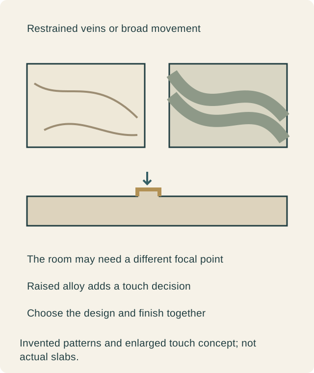
The St. Loxley product page describes flowing waves of soft brown, neutral green, hazy gray and sandy white, with Polished and Cambria Satin options. This supplies a distinctly different pattern direction within the same introduction.
Reading note: Cambria: St Loxley.
Broad movement deserves a view of the whole design. Around a sink, the visible areas may become separate strips; across a large island, the pattern has more room to read. Neither use is automatically wrong. Decide which areas the household actually sees from its regular seating and approach, then consider whether those areas give the chosen pattern a useful role.
If the cabinets already have pronounced grain, place a representative broad section of the pattern beside them. The issue may be competing directions rather than too much color. A simpler cabinet field could make the surface convincing; a household retaining strongly figured cabinets may choose a quieter release option instead.
Wyncrest makes touch part of the finish choice
Wyncrest’s product page describes ivory and alabaster tones with champagne-alloy veins, lists Polished and Cambria Satin, and notes select-partner availability. A quoted offer should identify the actual finish and source rather than imply universal distribution.
Reading note: Cambria: Wyncrest.
The raised-alloy detail identified in the announcement means that viewing the finish from across the showroom is insufficient. Ask to handle the appropriate sample as the provider permits. Run a clean hand over the transition and decide whether the tactile effect is part of the attraction. Do not generalize that sensation to another design merely because it also offers Satin.
A photograph can make a shimmering vein appealing while saying little about touch. A household that likes a uniformly smooth-feeling work area should compare the offered finishes directly. Another may value the subtle relief precisely because it adds a second way to experience the material. This is a preference to resolve before fabrication, not an automatic upgrade.
Keep the countertop’s job clear
The release offers different amounts and kinds of movement, so begin with the role of the surface. If the cabinets are the main feature, compare the quieter candidates in that context. If the island should become the focal point, give the broader pattern a fair full-scale review. If a metal-like line is central, keep the actual fittings present.
Avoid changing cabinet color, surface design and hardware simultaneously after every sample visit. That can produce an attractive new grouping without explaining why the earlier one failed. Hold the fixed parts of the room steady and compare the new surface choices against them. The household can then name the improvement it is buying.
A hypothetical kitchen separates appearance from touch
Imagine owners retaining walnut cabinets and choosing between a sweeping surface and a quieter warm-white proposal. The broad wave attracts them in a large image, but beside their cabinet doors they prefer the restrained option because the wood remains the room’s main pattern. That is a resolved design choice, not evidence that broad movement is unsuitable for every wood kitchen.
They also inspect Wyncrest in the relevant finishes because they like the champagne-colored accent. In this hypothetical review, they decide that the Satin relief is not the feel they want at their main preparation area. They compare the alternative finish before making the final selection. The touch decision remains separate from whether the color relationship works.
Another household might choose the relief for a bar surface and deliberately give it a more visible role. The release does not dictate one answer. Its value is the ability to compare these specific visual and tactile directions within a documented set of new designs.
Translate the chosen design into the actual pieces
Once a candidate wins, see it across the proposed countertop and any vertical extension. A narrow backsplash cut can reveal a different amount of movement from a broad island. A waterfall corner also needs its own arrangement; a shared design name does not automatically continue a vein around the fold.
Retain the selected design and finish together with the fabricator’s layout and edge decisions. Confirm the actual supply route, particularly for a design identified as offered through selected partners. The finished order should preserve the reason for choosing it: the right amount of movement, a deliberate relationship to the cabinets and fittings, and a surface feel the household has actually considered.
Sources & further reading
- Cambria: August26,2026 design introduction
- Cambria: Quintessa
- Cambria: Merivale
- Cambria: St Loxley
- Cambria: Wyncrest