

Design & industry
Omega Spring 2026: compare the acrylic back faces before building the full cabinet palette
The collection joins new doors, colors, acrylics and embellishments. The Rivvo/Rizzo back-face difference provides a concrete starting point for a coordinated package that still works when the doors open.
Omega’s Spring collection is worth reviewing as a cabinet program, rather than as a tray of new color chips. Its acrylic door choices introduce a particularly useful decision: what should the door look like from behind when the room is in use? Resolve that question alongside the main face, then build a controlled combination of wood, color and decorative details around it. A collection can offer many options without requiring a project to use them all.
Omega identifies the program as Spring 2026. It brings new finishes and door profiles together with acrylic options, reeded panels, a modern arch door and island-end embellishments.
Reading note: Omega: Spring2026 collection.
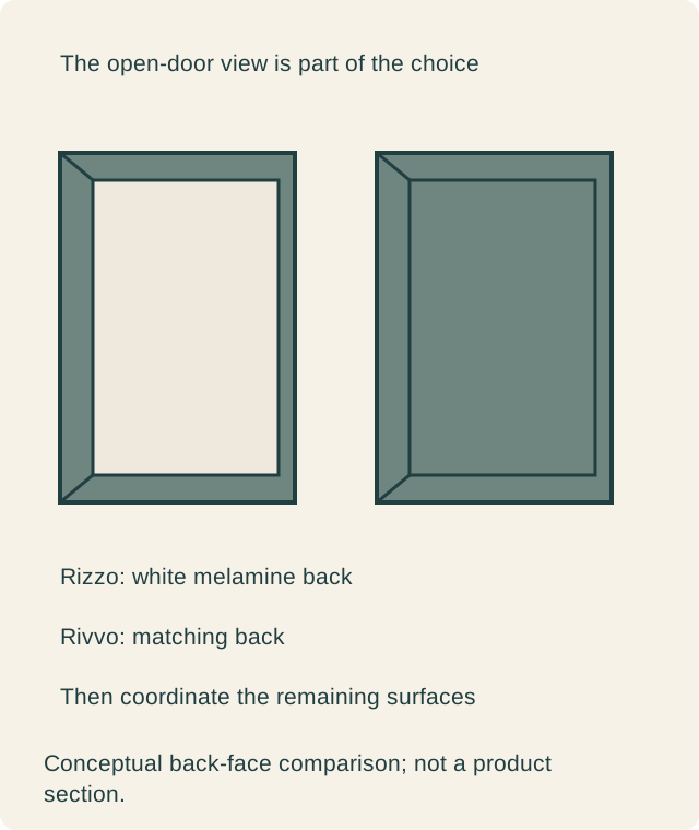
Omega lists Rizzo with a white melamine back and Rivvo with a matching back. Both styles accept the listed high-gloss and ultra-matte offerings; the color lists are not identical between sheens.
Reading note: Omega: acrylic door styles and back treatments.
Open the sample before choosing a door style
An elevation shows the room-facing surface, but an open cabinet presents a second view. Ask to see the offered complete front from both sides with its edge and hardware. Decide whether the contrast at the back is welcome, inconspicuous or inconsistent with the intended room. That judgment belongs to the actual door, not to an isolated face sample.
There is no need to declare one back treatment inherently superior. A buyer may like a distinct light interior-facing surface. Another may want the open front to continue the room-facing color. Keep the choice explicit, especially where the door often remains open during serving or preparation. A closed showroom display can conceal a difference that will be visible every day at home.
Select the sheen with the actual offered color
Use the program’s current sample and selection information for the color-and-sheen combination being considered. A familiar color word does not establish that it is offered with every sheen, nor that the same word describes the exact effect on another material. Confirm the combination before coordinating the rest of the room around it.
View the proposed front upright in the intended setting. Reflections, nearby windows and the angle of adjacent cabinetry can influence whether the large face feels comfortable in the composition. The purpose is to choose the appearance actually wanted, without turning gloss or matte into an unsupported durability ranking. Ask separately for the applicable care information and the complete offered door construction.
Give the companion wood a defined job
The broader introduction makes it tempting to combine several new expressions. Start by assigning a role to each proposed surface. The acrylic may form the main cabinet field, while a wood group defines a separate island or tall section. Another room may reverse that balance. The useful question is what the arrangement gains from the second material.
Then compare representative finished samples together. Do not ask a tiny wood chip to predict the whole grain field or assume the pictured species-and-finish pairing is available on every selected profile. Have the provider identify the exact combination it is quoting. A coordinated palette can tolerate deliberate differences; it becomes difficult to evaluate when the differences have not yet been named.
Treat the embellishments as separate decisions
Reeded panels, an arch treatment and island-end details can each change the cabinet composition. Their presence in a release does not make them a required set. Decide where a decorative form has a clear purpose and where a plain surface would give the neighboring material room to read.
Review the actual proposed part at its location. An island end is seen from different approaches than a wall cabinet door, and a decorative outline should make sense beside the adjacent fronts. If the room already contains several strong forms, omitting an embellishment can be the deliberate choice. The program remains useful when the project selects only the elements that support its design.
A hypothetical kitchen chooses a matching back and a quiet island end
Imagine a kitchen where a serving cabinet opens toward the dining area. The owners prefer the open front to continue its selected color, so they investigate the matching-back style with the provider. They also choose a separate wood group for the island after reviewing the offered samples together. The choice comes from the room’s open and closed views, rather than from a claim that one style is always more luxurious.
The first concept also includes a decorative island end. Seen beside the selected wood grain, that treatment adds another focal point the owners do not want. They retain a simpler proposed end and keep the material change as the main distinction. The provider then checks which companion parts are actually available for the selected package and identifies their treatments in the quote.
This hypothetical room has used the release fully as a decision resource without installing every new feature. A different household might prefer the contrasting back or make a decorative end the focal point. The valid result is a complete, coherent package. The collection’s size is not a score for how many options a buyer should order.
Make the quote describe more than the front face
Identify the door style, current color-and-sheen combination, back treatment and proposed exposed surfaces in the order. Ask how ends, fillers and other visible components will be finished. Do not assume that an acrylic door implies an identical surface or construction for every companion part. Review the actual package before comparing it with another quote.
If a combination changes during design, reopen the affected appearance questions. Substituting the front style may alter the open-door view; changing an island treatment may alter the balance of the palette. Keep accepted samples and drawings tied to the current cabinet list. The release supplies possibilities, while the order needs a defined result that can be checked.
Omega’s seasonal introduction does not establish an exact first-sale date or the supply arrangements for a particular project. Confirm those arrangements with the provider. Its practical value is the opportunity to compare specific new choices together, beginning with an easily overlooked back face and ending with the surfaces the household has actually chosen to see.
Sources & further reading
- Omega: Spring2026 collection
- Omega: acrylic door styles and back treatments