Low-iron or standard clear glass for a cabinet display?
Low-iron glass reduces the green cast in a display, especially along exposed shelf edges. It does not by itself remove reflections or change the structural glass specification.
Choose low-iron glass when the appearance of the objects and the exposed glass edges matters enough to justify the upgrade. Standard clear glass remains a reasonable choice when its tint is acceptable in the finished display. The useful comparison is the same cabinet, objects, lighting and glass thickness with different base glass. A small sample held in an empty showroom tells less than a full shelf edge viewed against the actual cabinet interior. Neither the word clear nor an expensive-looking edge establishes the complete specification.
Why the edge can look greener than the face
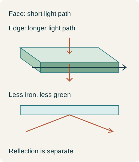
Vitro explains that iron compounds in ordinary float glass selectively absorb visible light, producing its familiar green cast. Reducing iron improves color neutrality. Looking through the face sends light through the sheet thickness; looking into an edge can send it through a much longer path within the glass. That is why a shelf may seem almost colorless from above while its front edge forms a conspicuous green line. Greater material thickness also makes the tint more apparent.
For a display cabinet, this mechanism produces two separate visual questions. Does the glass change the apparent color of the objects behind it? And do exposed shelf edges create a stripe that the design does not want? A framed door with most edges concealed and a thick, openly displayed shelf need not show the same benefit from changing glass. This is a design inference from the optical mechanism, not a claim that every framed door can use a cheaper specification. Its own viewing conditions still decide whether the tint is acceptable.
Low-iron does not mean an invisible edge
Guardian distinguishes mid-iron and low-iron glass and describes its UltraClear low-iron product as having an ice-blue edge. Reduced green tint therefore should not be written as a guarantee of completely colorless glass under every viewing condition. Marketing terms such as extra-clear and ultra-clear need to resolve to the actual offered product. For a coordinated set of doors and shelves, the buyer should compare the proposed glass identities together rather than assume similar adjectives mean identical optical results.
Diagram Conceptual light paths through a glass shelf. Colors are explanatory, not calibrated samples; low-iron glass does not mean a perfectly colorless or reflection-free assembly.
A white porcelain display with visible shelf edges
In a hypothetical dining-room cabinet, the owner wants white porcelain to read against a pale interior without a pronounced green shelf line. The review uses the proposed finished glass thicknesses, a full exposed shelf edge, the porcelain and the planned lighting. Standard clear glass produces an edge color the owner dislikes; the low-iron sample gives the preferred appearance. The owner selects low-iron for both the transparent door inserts and the exposed shelves in that display, while keeping opaque shelves in the adjacent closed storage. The decision buys a visible result in a specific location, not a claim that all storage improves with low-iron glass.
That selection does not call for thinner shelves to recover the upgrade cost. The supports, span, load and required glass processing remain part of the shelf design. Nor does changing the door insert automatically change its retainers or edge treatment. Keep those functional decisions fixed while evaluating the optical upgrade; otherwise an apparently better-looking comparison may conceal an entirely different assembly. If a supplier offers another low-iron product, compare it with the accepted finished sample before treating the replacement as visually equivalent.
Color neutrality and reflections are different problems
Guardian describes anti-reflective glass as a coated product that reduces reflections at the glass surface. Its Clarity Neutral product uses a low-iron base, combining the base glass’s color neutrality with the coating’s reflection control. This distinction matters when a cabinet seems difficult to see into. A green cast through the glass and a reflected image of the room are not the same defect. Buying low-iron glass to solve a strong window reflection may leave the buyer disappointed even though the glass delivered is exactly the product ordered.
Return to the hypothetical porcelain display. Suppose the approved low-iron sample still shows a bright reflected window from the dining chair. The owner keeps the low-iron choice for color but changes the display lighting and viewing arrangement during the mock-up. If the reflection remains unacceptable and those arrangements must stay fixed, an anti-reflective glass assembly becomes a separate design alternative to evaluate. It is not an upgrade silently included in the words low-iron. The first decision is complete; this additional requirement changes what the next comparison must address.
Keep processing and appearance on separate lines
Guardian notes that low-iron glass can receive further processing, coatings and lamination. Its fabricator guidance also calls for an adjusted tempering cycle because this glass absorbs less energy. Those are manufacturing considerations; low iron itself is not a statement that a supplied insert is tempered, laminated or suitable for a particular shelf load. The purchase description should retain the specified processing and edge finish alongside the optical product identity. Do not remove one requirement simply because the other has been upgraded.
For the final visual review, include both a view through the glass and a view toward the exposed edge. Keep the intended objects and cabinet background in place and inspect under the planned light, rather than comparing unrelated catalog photographs. An edge sample alone can exaggerate a difference that barely affects a concealed insert; a face sample alone can miss the prominent stripe across an open shelf. Accept the complete display appearance you actually want to live with. That gives low-iron glass a clear purpose and leaves standard clear glass available where its appearance already meets the brief.
Pure White
Cream White
Light Warm Gray
Gray
Navy
Black
Oak Tone
Dark Walnut Tone
Design study These finish studies are design references, not a list of currently orderable colors. Screens and lighting change the appearance; compare a physical sample before choosing.See all finish options →
Compare the actual countertop products, heat-source routine and fabrication proposal. A fired porcelain slab and resin-bound quartz are different materials, but neither label replaces a complete kitchen specification.
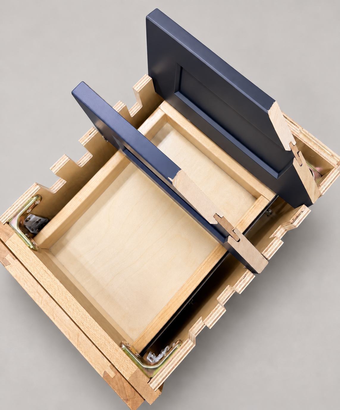
The sample shows the door frame, a separate center panel, the face frame and the cabinet box. Each component has its own place in this Shaker construction.
Shaker construction: door frame, center panel, face frame and cabinet box. The cutaway helps locate these parts; confirm each material in the specifications for the selected cabinet.
01 / Door frame
The Shaker door has rails and stiles around a separate center panel. The frame and center panel are different components; confirm their materials in the specifications for the selected cabinet.
02 / Face frame
The face frame surrounds the opening at the front of the cabinet box and sits behind the doors. The face frame, door frame and cabinet box are separate parts.
03 / Cabinet box
The sample exposes the cabinet sides, interior surfaces and layered edges. The image does not establish the wood species or material specification of a selected cabinet.