Treat a hardware finish name as a way to find a candidate, then compare physical examples of the products you intend to buy. Similar names do not establish the visual match you want across different suppliers. Judge the metal beside the cabinet finish and the other selected hardware, under the room’s relevant lighting and in the orientation in which each piece will be used.
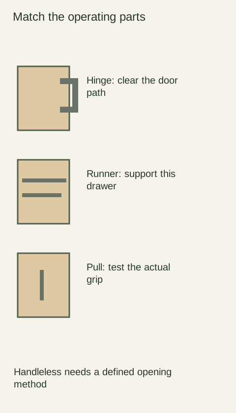
Diagram Compare the actual selected knob and pull finishes. This concept diagram does not reproduce a particular metal finish or establish a cross-brand match.
Separate identity from a descriptive name
Keep the manufacturer, product model and exact finish code with each sample. Emtek’s ordering guide combines product and finish codes to identify cabinet hardware. This is a practical reminder to preserve the supplier’s complete identity rather than reducing the choice to a phrase such as “warm brass.”
A sales description can group finishes broadly without specifying an exact visual equivalent from another company. Record the full designation even if the project notes use a shorter nickname. When a substitute is proposed, compare the actual item and update the record; a repeated word in the finish name is not a completed appearance review.
Compare tone, reflectivity and surface pattern separately
Begin with the color family: does the metal look warmer, cooler, darker or more muted beside the cabinet sample? Then examine reflection. A polished surface may pick up colored surroundings that a more diffuse surface handles differently. Move the samples together rather than comparing a brightly lit pull with a shaded one across the room.
Next inspect the surface pattern and the shape of the piece. Brushing direction, textured recesses and curved edges can produce different highlights even when the underlying finish is similar. Compare a knob with the intended pull, not only flat finish chips. A flat reference can help with color, but it does not reveal how light travels across a rounded handle or an angled base.
Decide what kind of relationship you want
An exact-looking match and a deliberate coordination are different design goals. If adjacent pieces should read as the same finish, hold them close together against the intended front. If they sit farther apart and are meant to complement rather than duplicate each other, judge them at their actual viewing distance while keeping the distinction documented.
Avoid endlessly chasing a small difference visible only when samples touch if that comparison does not represent the installation. Conversely, do not dismiss an obvious mismatch between neighboring knob and pull just because each looks attractive alone. Define the relationship by location and intended effect so the approval has a practical basis.
Account for the appearance after use
Some surfaces are intended to change. Emtek describes its unlacquered brass finish as evolving in appearance over time. A newly delivered sample therefore cannot be assumed to preserve its initial appearance indefinitely. Ask how the selected finish is expected to develop and what care instructions apply to that specific product.
Imagine selecting a new brass pull to match an existing, frequently handled knob. They look close when new, but the intended finishes do not share the same aging behavior. The decision should consider whether a changing relationship is acceptable, rather than approving the pair solely on the first comparison. Do not polish or chemically alter a sample to force a match unless that treatment is explicitly appropriate for the finish.
Approve an identified set, then compare the delivery
Photograph the accepted group to record identities and positions, while retaining the physical references where possible. Write which products were compared and whether the goal was a close match or coordinated contrast. Include the selected sizes and textures; another shape in the same finish may reflect light differently and deserve a quick comparison of its own.
On delivery, compare representative pieces with the retained samples in the same lighting before installation. If the appearance differs, preserve packaging and model labels and resolve the question with the supplier. A phone photograph is useful for communicating the concern, but it should not become the only color standard. The result you are buying is a considered relationship among actual pieces, supported by exact ordering identities.
Pure White
Cream White
Light Warm Gray
Gray
Navy
Black
Oak Tone
Dark Walnut Tone
Design study These finish studies are design references, not a list of currently orderable colors. Screens and lighting change the appearance; compare a physical sample before choosing.See all finish options →
A painted door, a wood-grain side and a plywood cabinet box can belong to the same cabinet. Here is how to read those parts, what the sample photos actually show, and which details to put on a quote.
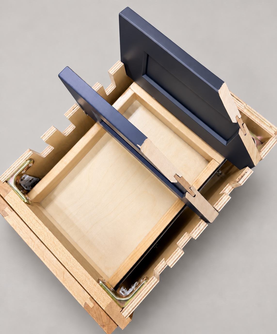
The sample shows the door frame, a separate center panel, the face frame and the cabinet box. Each component has its own place in this Shaker construction.
Shaker construction: door frame, center panel, face frame and cabinet box. The cutaway helps locate these parts; confirm each material in the specifications for the selected cabinet.
01 / Door frame
The Shaker door has rails and stiles around a separate center panel. The frame and center panel are different components; confirm their materials in the specifications for the selected cabinet.
02 / Face frame
The face frame surrounds the opening at the front of the cabinet box and sits behind the doors. The face frame, door frame and cabinet box are separate parts.
03 / Cabinet box
The sample exposes the cabinet sides, interior surfaces and layered edges. The image does not establish the wood species or material specification of a selected cabinet.